

Falcons New Logo Update Sparks Online Debate and Nazi Imagery Comparisons
The Atlanta Falcons ignited a widespread social media reaction after updating profile pictures with a vintage 1960s-era graphic.
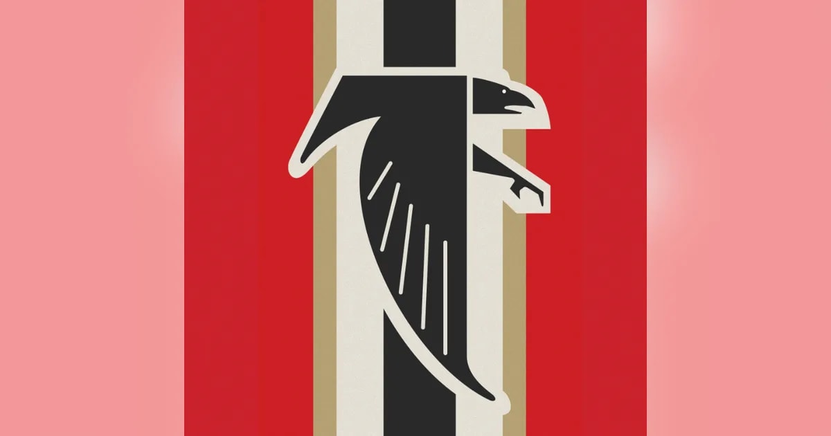
The Atlanta Falcons sparked significant online discussion after updating their social media presence with a vintage design. The graphic quickly went viral, drawing unintended comparisons to historical symbols.
The franchise published the image on X with the caption "New PFP," showcasing a black falcon set against red, white, and gold-toned stripes. While many internet users engaged in joking commentary or utilized artificial intelligence to generate custom responses, others pointed out similarities to Nazi-era imagery. For more context on recent team branding adjustments, read this Atlanta Falcons Unveil New Profile Artwork Amid Online Controversy Over Falcons Logo report.
Origins of the Design and the falcons new logo Discussion
Despite heavy discussions regarding a falcons new logo, the graphic is actually a revival of historical franchise iconography. The artwork features the team's original 1966 crest, which displays a geometric black bird with outstretched wings forming an "F" shape.
The central stripe pattern traces back to the team's helmets from 1966 through 1969. Original owner Rankin Smith Sr. incorporated old gold alongside red and white to ease local college football rivalries between University of Georgia and Georgia Tech supporters.
Familiar Reactions and Team Performance
This online response closely mirrors events from September 2024, when a different throwback helmet profile picture similarly drew comparisons to historical German symbols.
Beyond design debates, some fans questioned the team's focus amid its current season. The Falcons hold a 2-4 record following a recent loss to the Chicago Bears and prepare to face the San Francisco 49ers, where the squad is scheduled to wear 1966-inspired throwback uniforms.
Sources: FOX 5 Atlanta, The Guardian, USA Today.
Frequently asked questions
Did the Atlanta Falcons release an entirely new logo?
Why did the profile picture spark controversy?
What is the history behind the helmet stripe pattern?
Have the Falcons officially confirmed a permanent logo change?
Related stories

जो रूट की सचिन तेंदुलकर के ऐतिहासिक रिकॉर्ड पर नजर, मास्टर ब्लास्टर ने की तारीफ
इंग्लैंड के स्टार बल्लेबाज जो रूट टेस्ट क्रिकेट में सचिन तेंदुलकर के सबसे बड़े रिकॉर्ड को चुनौती देने के करीब पहुंच गए हैं, जिस पर महान बल्लेबाज ने अपनी प्रतिक्रिया दी है।

Opening-Day Honours Go to Zimbabwe in Zimbabwe vs Afghanistan Match
Zimbabwe claimed opening-day honours against Afghanistan as Taylor and Bennett delivered strong performances in Sharjah.
Star Players Demand 40 Crore Ahead of Indian Premier League Mega Auction
Two star cricketers have reportedly informed their franchises they will only accept retention ahead of the 2028 mega auction if given 40 crore rupees.

Nepal Sets 129-Run Target in ACC Men's U-19 Asia Cup Match for Nep U19 vs Ind U19
Nepal set a 129-run target for India during their encounter at the ongoing ACC Men's U-19 Asia Cup in Oman on Friday.